
Pardee Test Shoot
This is a set of photos from a new listing of a home for sale in Venice, CA. It compares pictures that were taken by two photographers. I do not know who did the first set, but they are shared on the MLS with watermark. The second set of images attached was taken by yours truly. Also, I did not see the photos until after my photoshoot. I find it interesting to see how our styles compare with angles, lighting, details, and editing.
Let's begin.
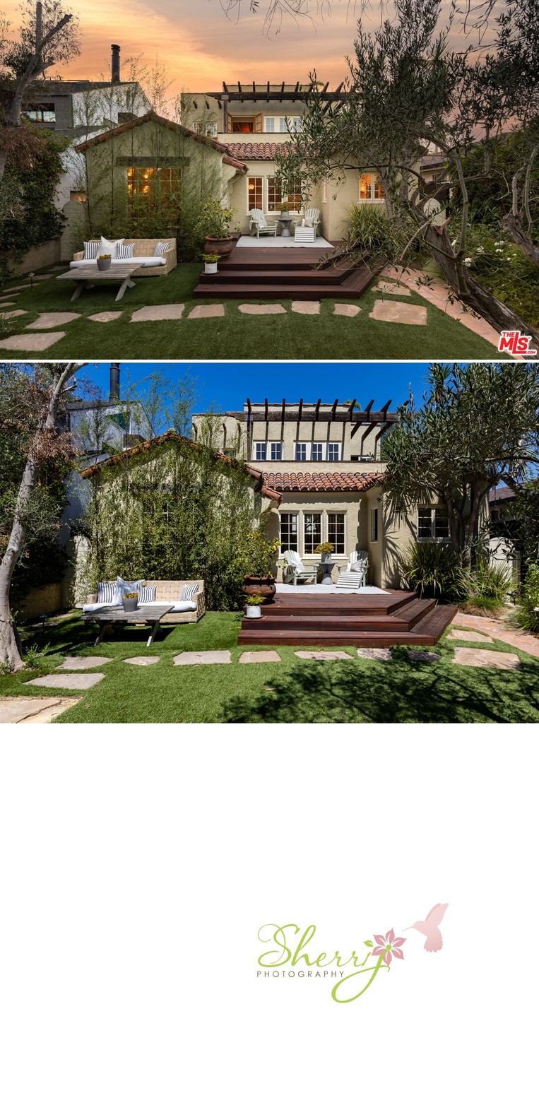
The first picture is the front of the house. We see an exterior twilight straight on vs daytime, slightly off center. The twilight has dreamy colors of the sunset and the warm glow from the windows seems to invite you in. For the daytime shot, I went a little more to the left to avoid the tree covering the exterior and cropped closer so the house takes up more of the space.
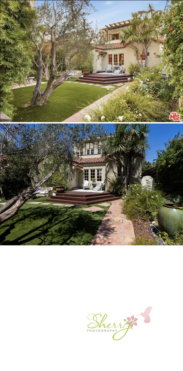
Ok, another comparison of the front showing the house from an angle. My image includes more of the pathway and large water fountain on the right and the original shows more of the front yard with a warm yellow saturation. It kinda doesn't even look like the same house, right? This set demonstrates how important sun can be for the front exterior shot as well as editing colors.
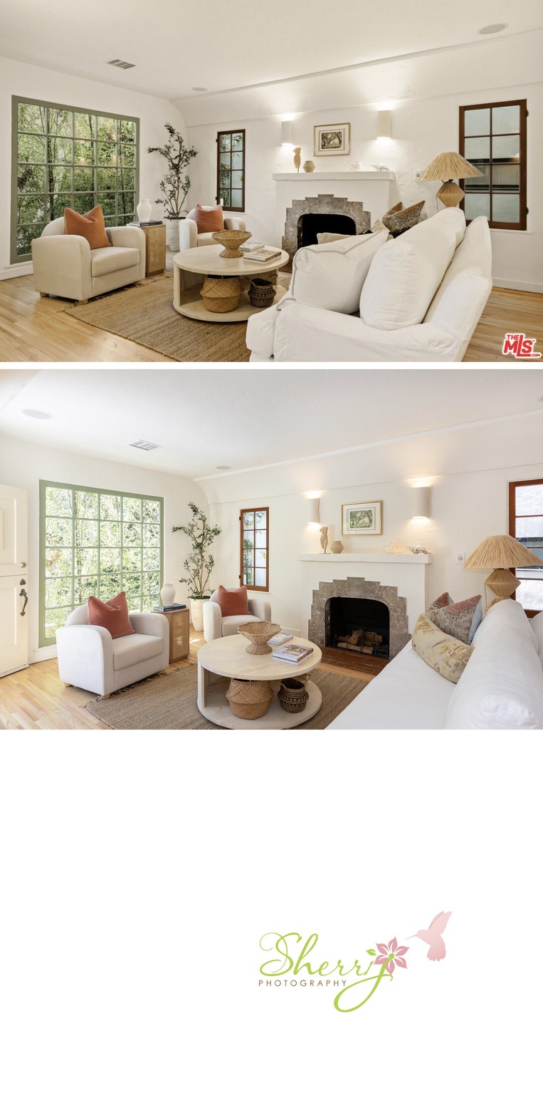
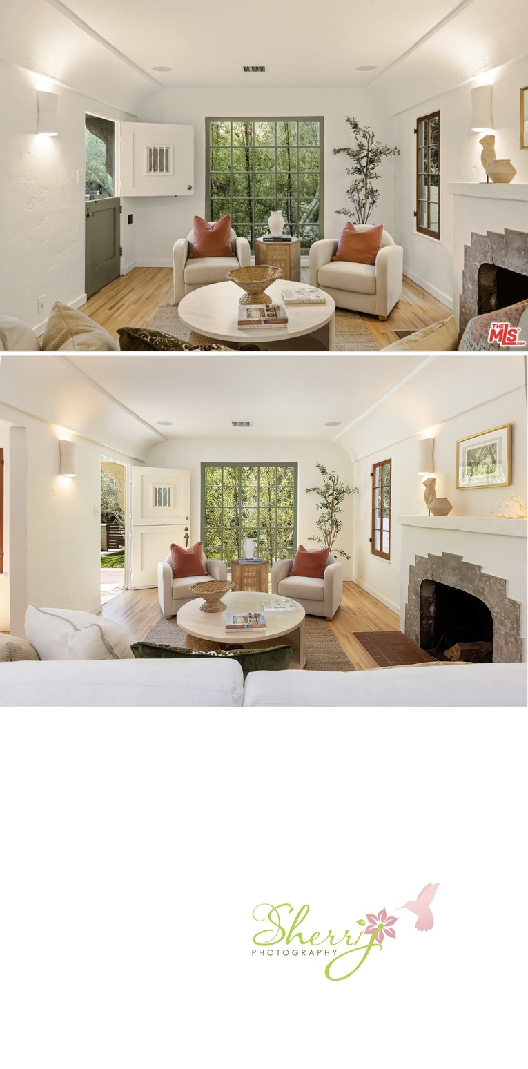
Second angle of the living room shows the big picture window at the front of the house and an open front door inviting you from outside. Again, the pillows on the couch were removed, this time on the right side, to show more of the fireplace details. Before taking this shot, I made sure to move the chairs and table in front of the window to be more symmetrical, and I moved the big basket on the coffee table to the side to create a more balanced arrangement.
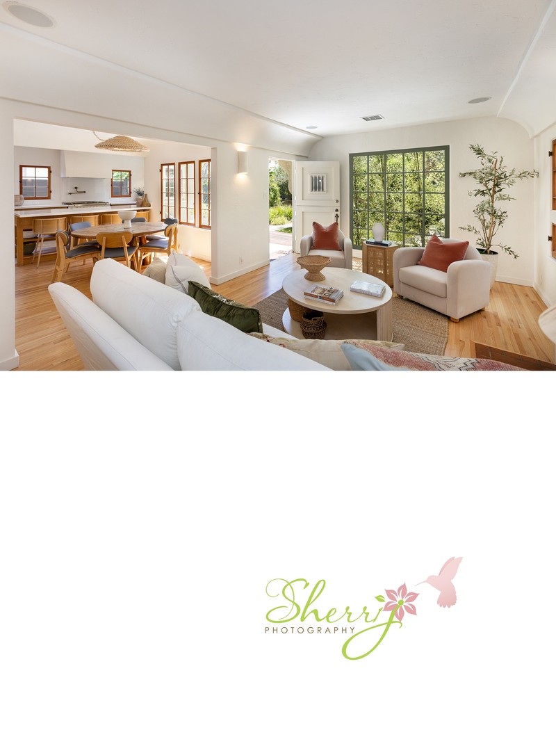
Above: one of my favorite photos from the set showing flow from the front door, to living room, then to dining room, and kitchen in the far left. I didn't have something to compare it to.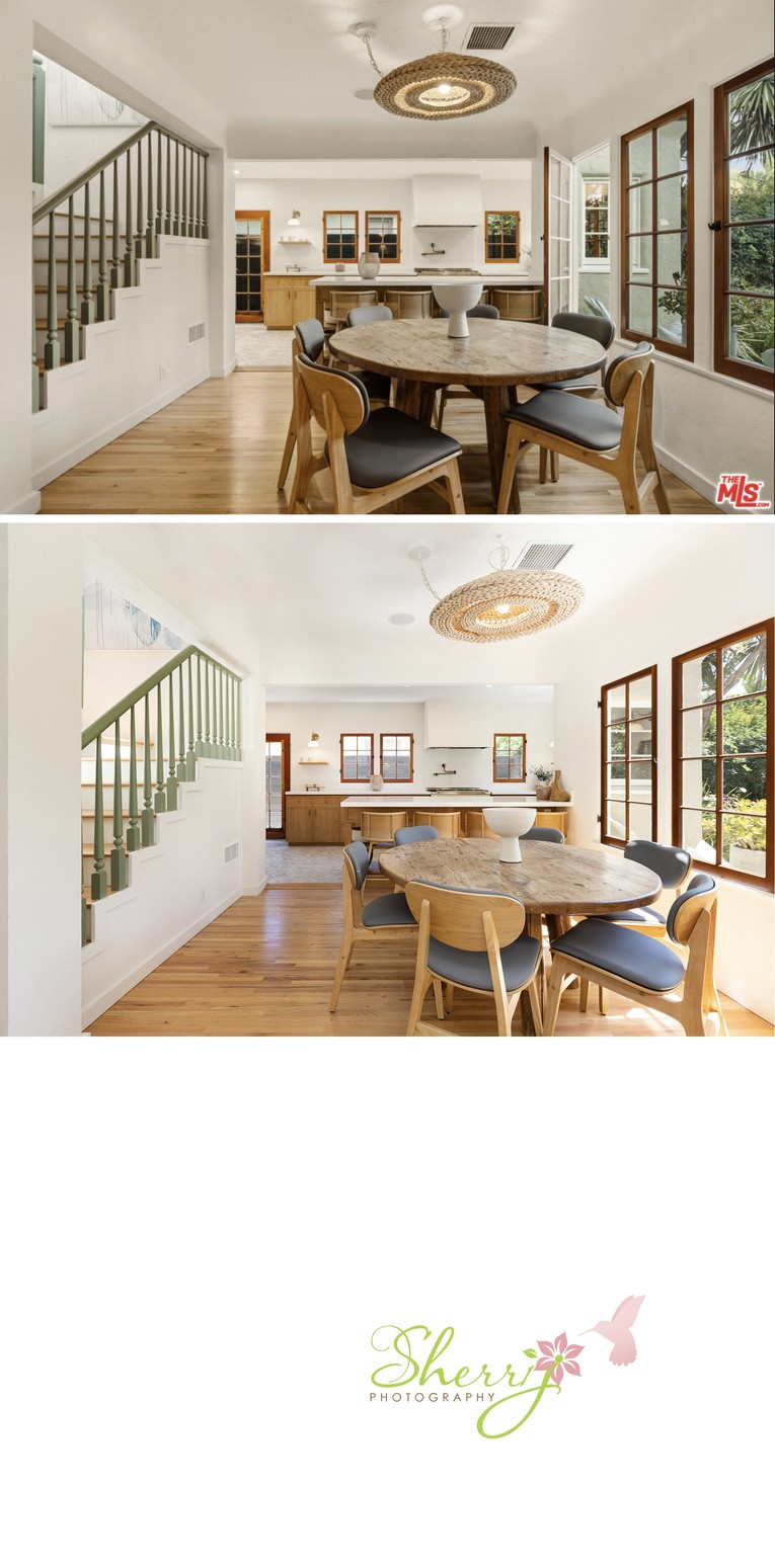
Here we see two similar photos going from the living room into the dining room, towards the kitchen. The position of the camera is so similar; it's prob only about a foot difference, with my shot being a little more to the left. I also elected not to open the window on the right.

Above is another shot of the dining area. My OCD is really showing here. I moved the chairs and vase to be centered all around. I also moved the decorative piece on the kitchen island so we can see the stove a little better. I feel this shot makes you want to take a seat and have a snack!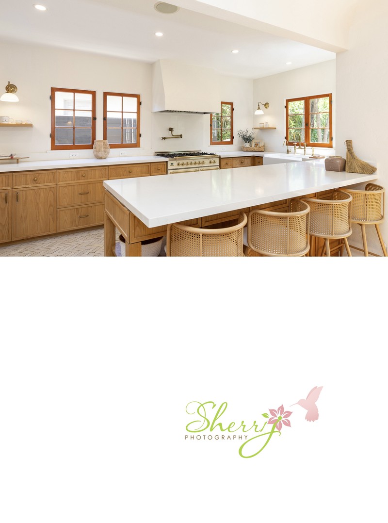
Another shot of the amazing kitchen by me. I didn't have something to compare it to from the before set. No notes.
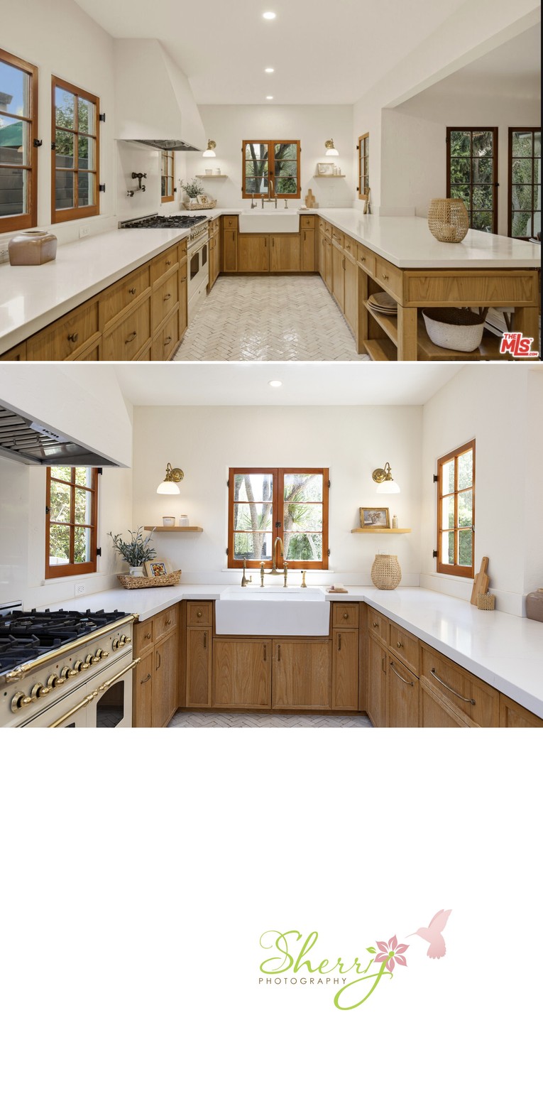
Ok the kitchen straight on. We see a wide shot vs more close-up. I did a closer shot to make you feel like you're in the space, and supplemented more of the kitchen details like the stove, in other shots.
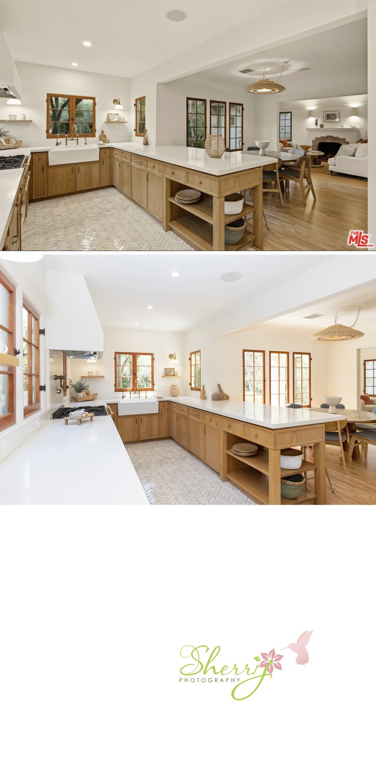
Kitchen angled to dining area. Admittedly, I was just getting a bit creative here, going over the countertop with a focus more on the kitchen island. I did play around with the decorative wood stand next to the stove; it was moved around about 3-4 times and ended up there. I also moved the things to the right of the sink area. You also see my centered vase on the dining table with chair lined up, right? ;)
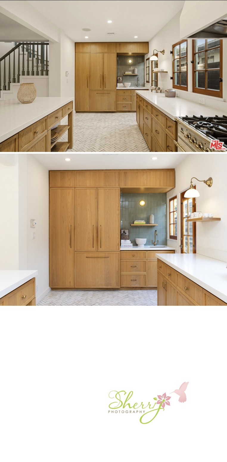
Reverse kitchen towards built-in fridge hidden in cabinets. I shot this closer up, and you know why... yes, because it's more inviting. I do also like the original shot done wide, showing more of the details like windows and stairs on left going to the second level. Which do you prefer?
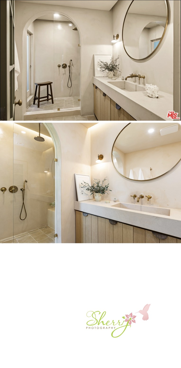
The downstairs bathroom. I love the top angle showing the room from the door. The bottom, second angle shows the bench in the shower. Below, are two more angles I captured of the bathroom with a special feature door that opens to the backyard!
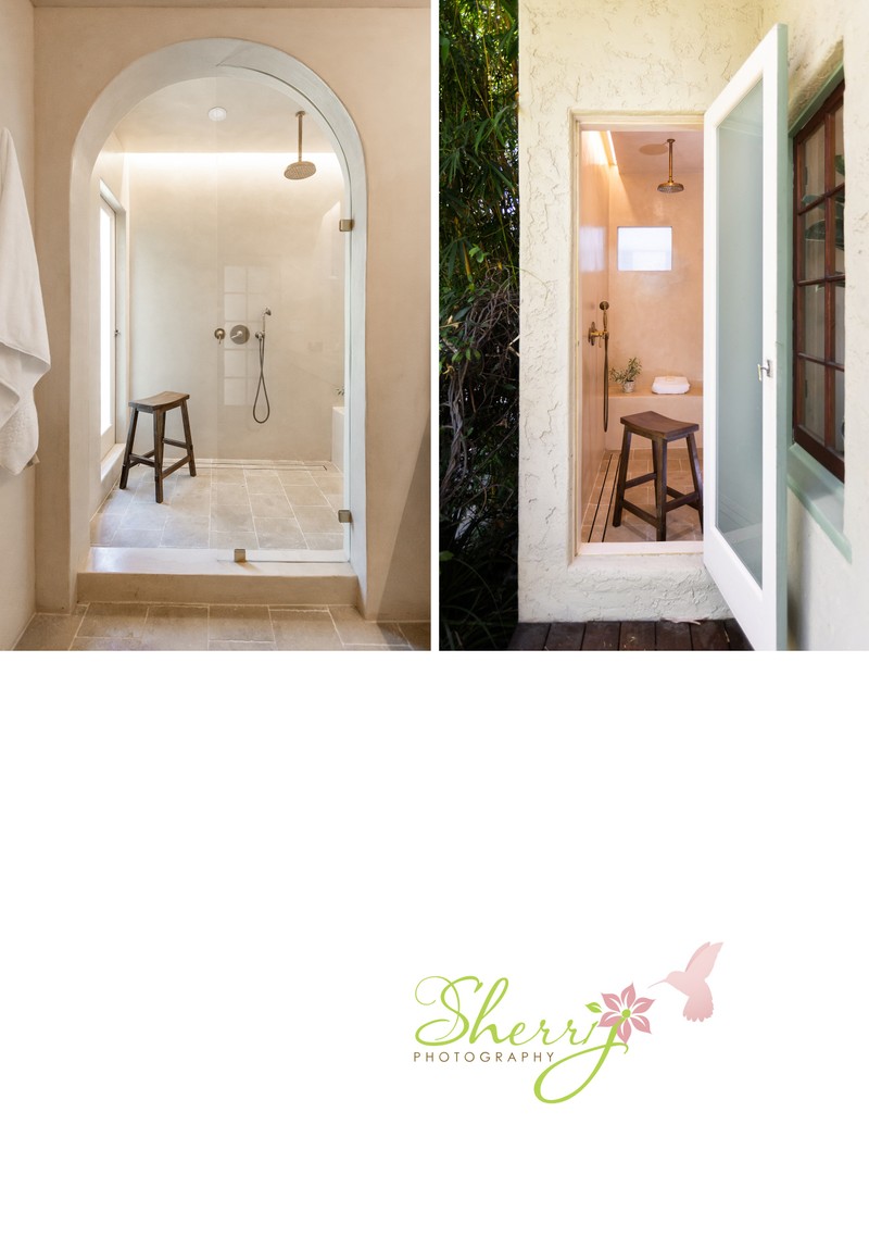
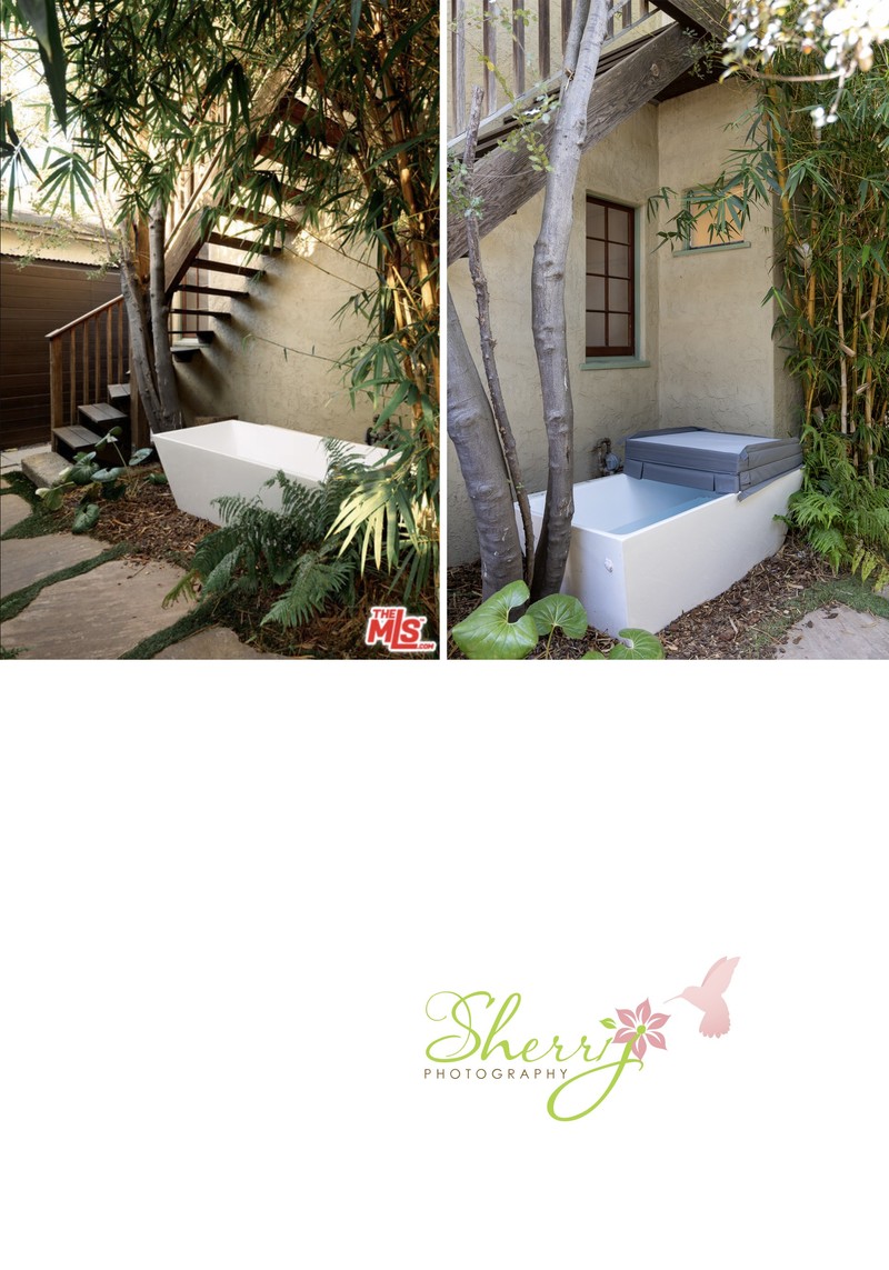
Around the corner is an outdoor tub. Photo 1 below shows the tub angled towards the stairs that go up to the primary bedroom. The second photo is the same tub, but more tucked away under the stairs.
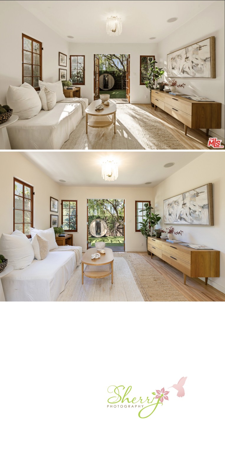
Ok, back inside, we're looking at the bonus living area / den. You can really see how time of day impacts the light coming into a space. Image 1 was later in the day with long shadows, a couple hours before sunset. Image 2 was late morning before noon. Besides that, these two are almost identical for composition.
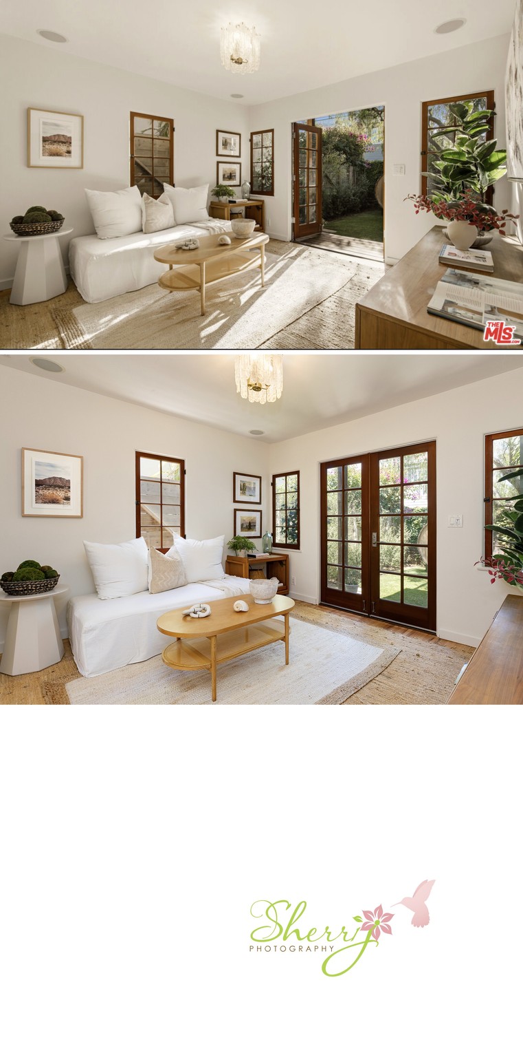
Den second angle: I chose to close the door in this shot to accent the warm wood design of the French Doors, creating a cozy feeling.
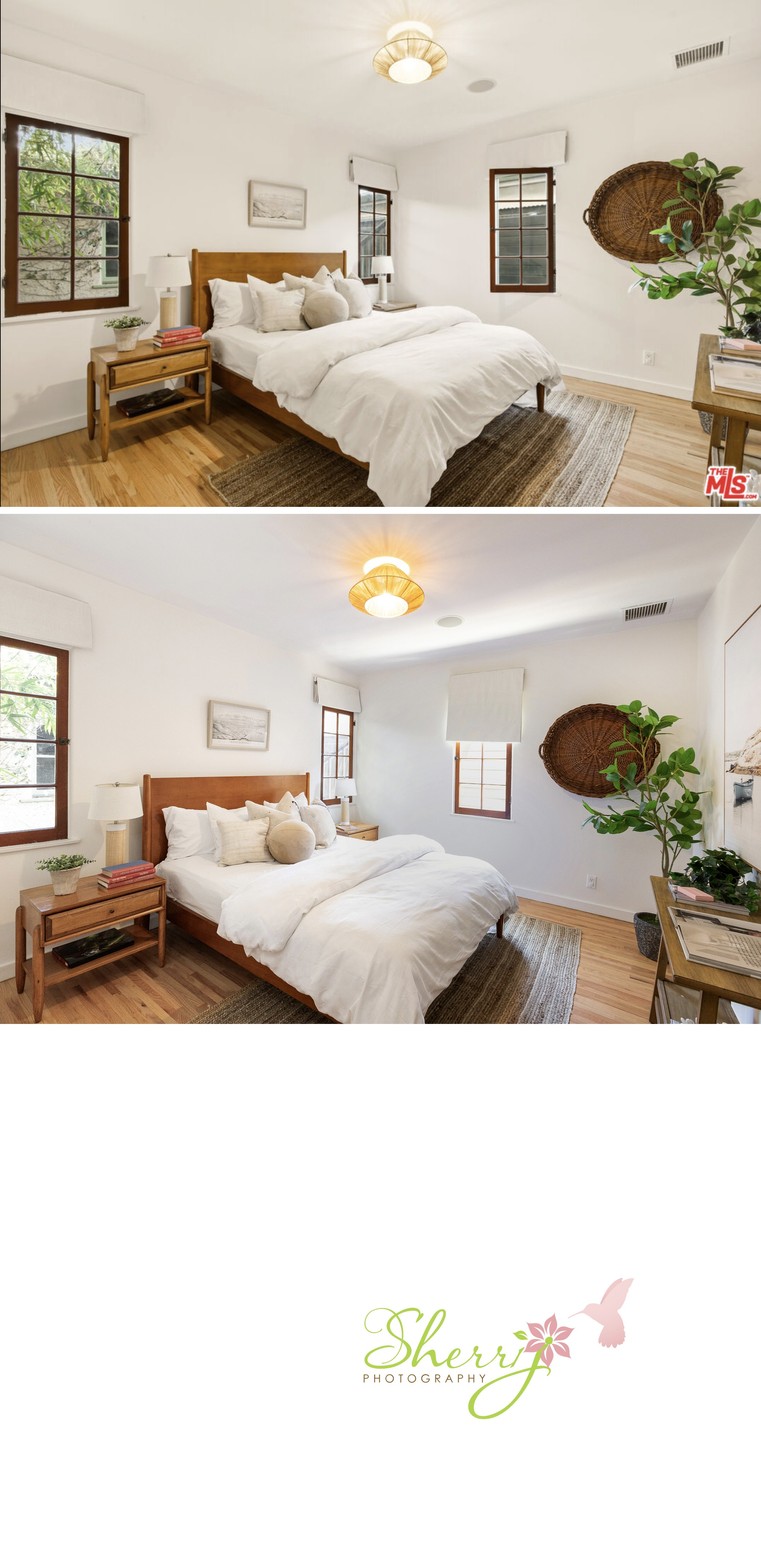
Lower Level Bedroom: in the bottom picture, I captured more of the third wall on the right, showing the big artwork on the wall, in exchange for the full detail of the window on the left. I also left the windows bright to reduce attention to the fence outside.
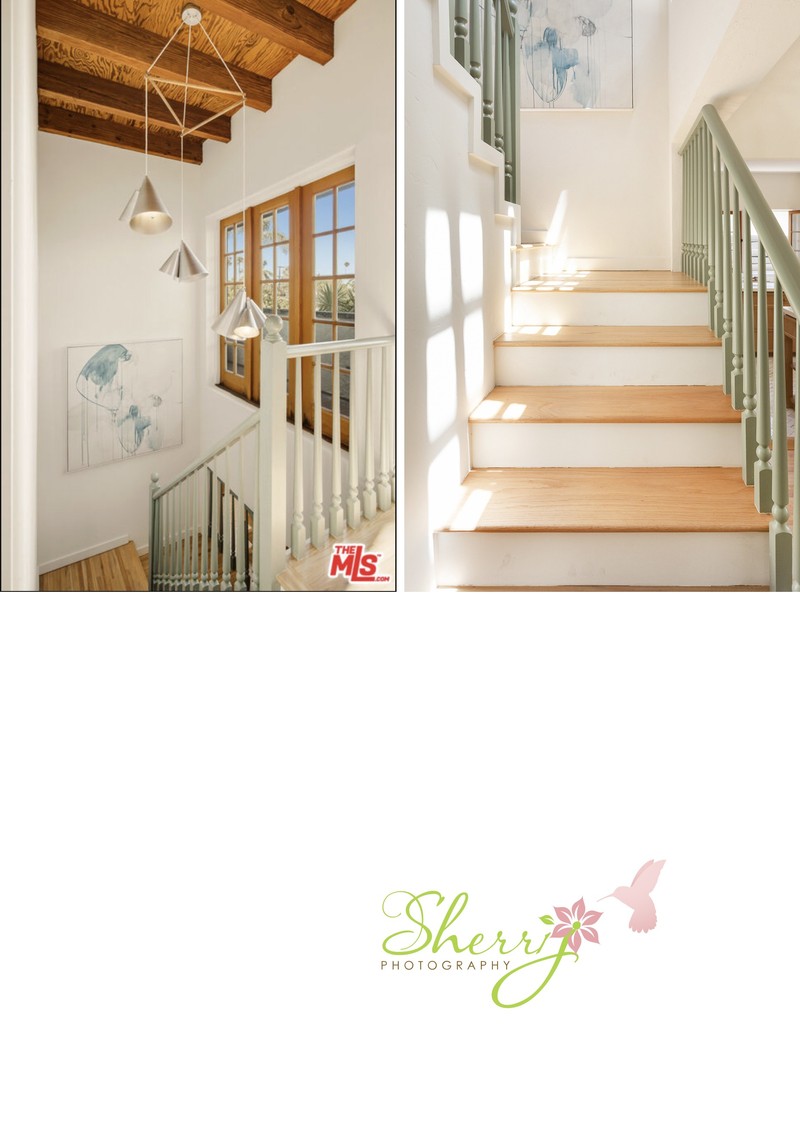
Stairs. The left photo focuses on the entire space with the light fixture, windows, artwork, wood beams, and railing. The right photo is more of a mood with the light coming in, inviting you to walk up.
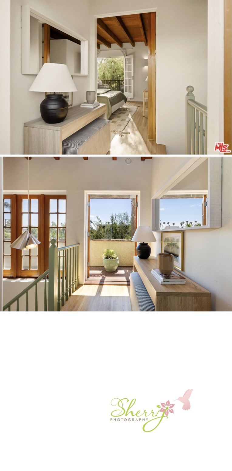
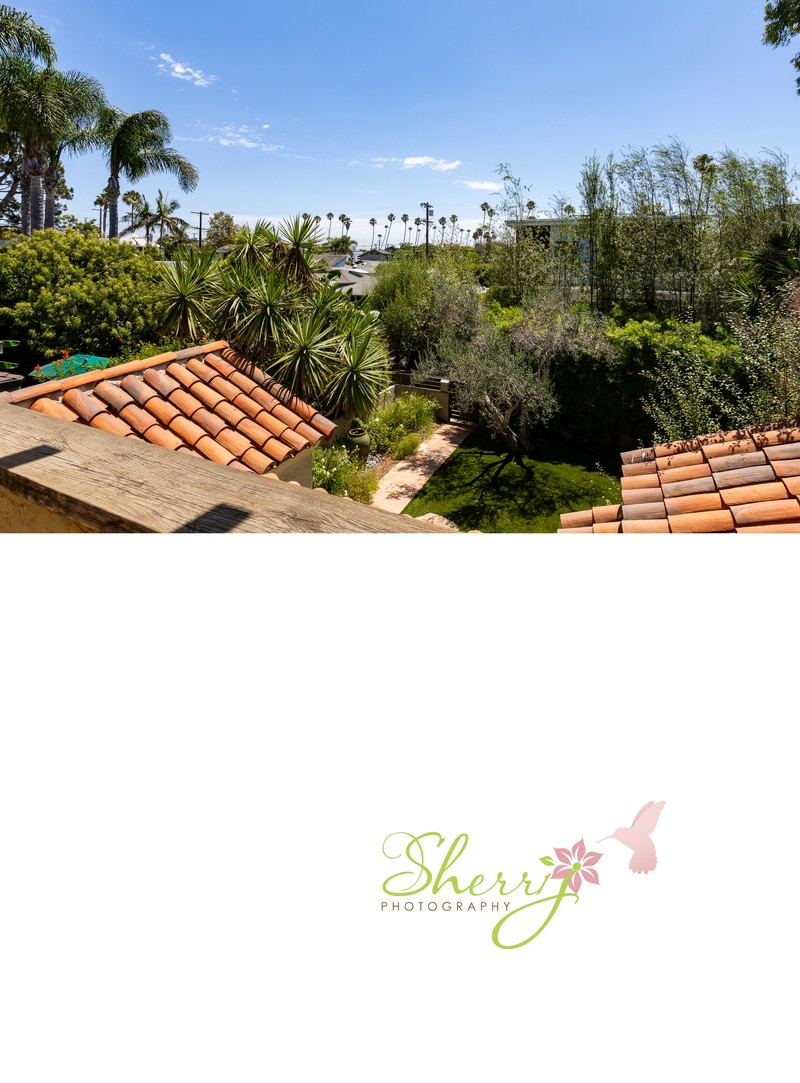
Top of the stairs. This is a great transitional space from the stairs into the top floor/ Primary bedroom. The angles are opposite; one is looking outside and the other is towards the bedroom. Both are nice. Below is my shot of view of the front yard from that spot.
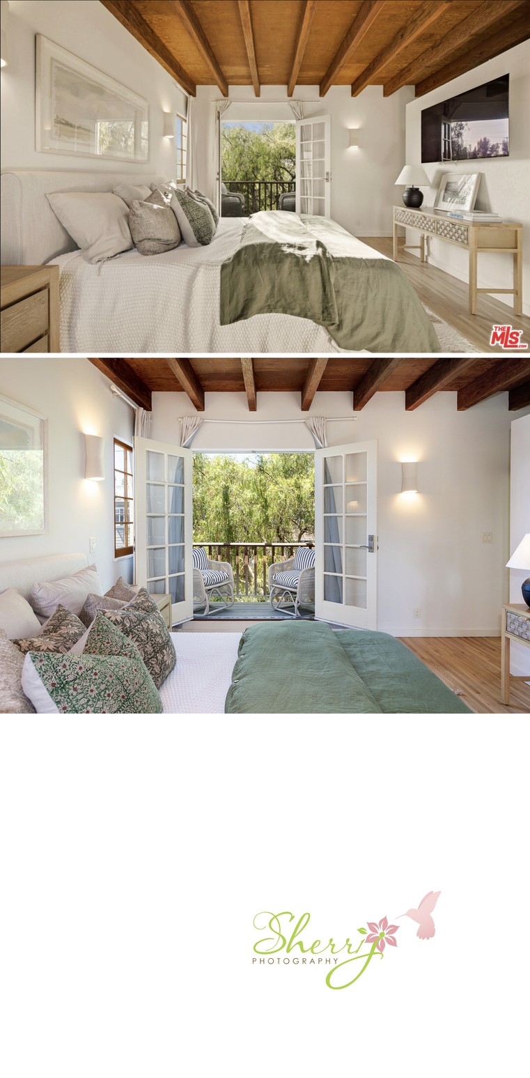
Primary Bedroom view of balcony. I moved the nightstand by the door so it would open all the way and angled the chairs outside to be 45 degrees to be more inviting. I also like the original shot of being more wide to see the TV on the right wall and more of the wood beam ceiling.
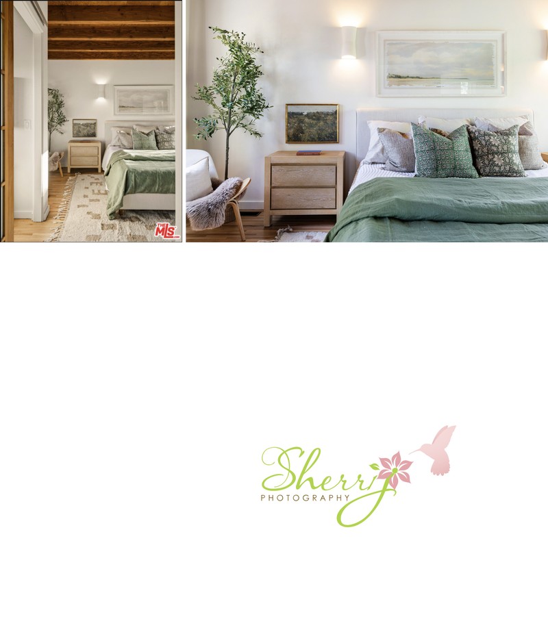
Primary Detail shot: the first photo is vertical, wide, and warm vs the second photo is horizontal, medium crop, and cool. I feel my perspective makes you wanna slide into bed or read a book on the chair next to the window on the left.
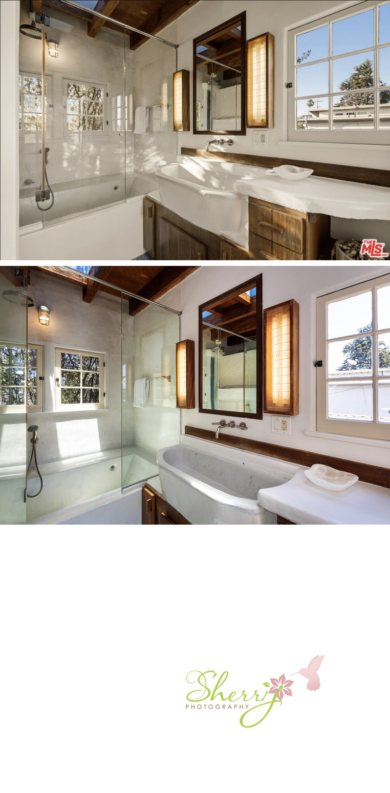
Primary Bathroom. I made sure to block the windows of the neighbor's house with the window frame to make the space feel more private.
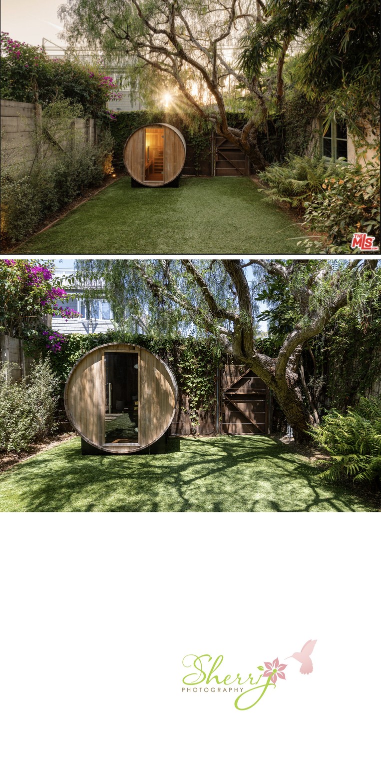
The backyard with circle sauna. The biggest difference is twilight showing a bigger yard vs daytime closer-up shot feeling more inviting and private, and minimizing the power lines in the sky.
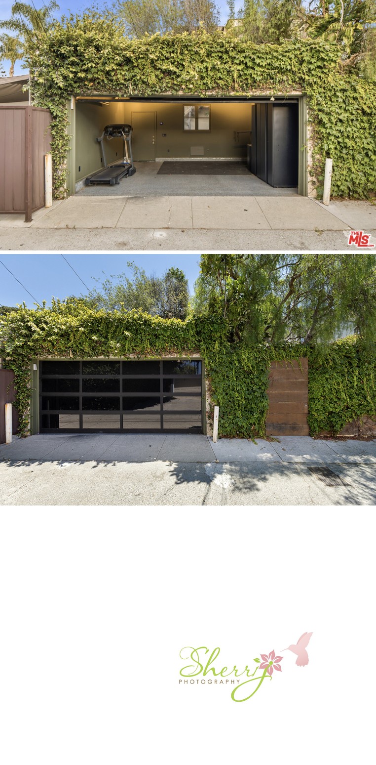
This is the alley view access to the garage. I also took a picture with it open but ended up submitting the one showing the beautiful glass garage door and side door entry into the backyard with ivy covering the wall. In my mind, the second shot is a two-car garage and the first one is more of a one-car with a treadmill and tool storage. Both are nice.
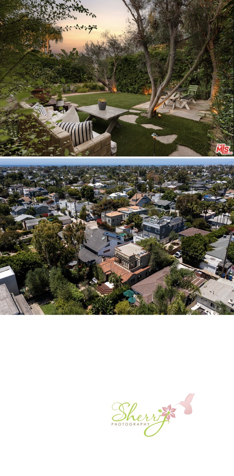
Last but not least, here is a bonus shot. I'll admit, I LOVE the twilight shot of the front yard! It makes the space look really dreamy and perfect for entertaining. (It didn't look like that when I was there because of the harsh daylight shadows from the trees). My photo shows the home in proximity to the Pacific Ocean, taken with a drone.